Mobile-First UI
Optimized mobile experience that keeps customers engaged
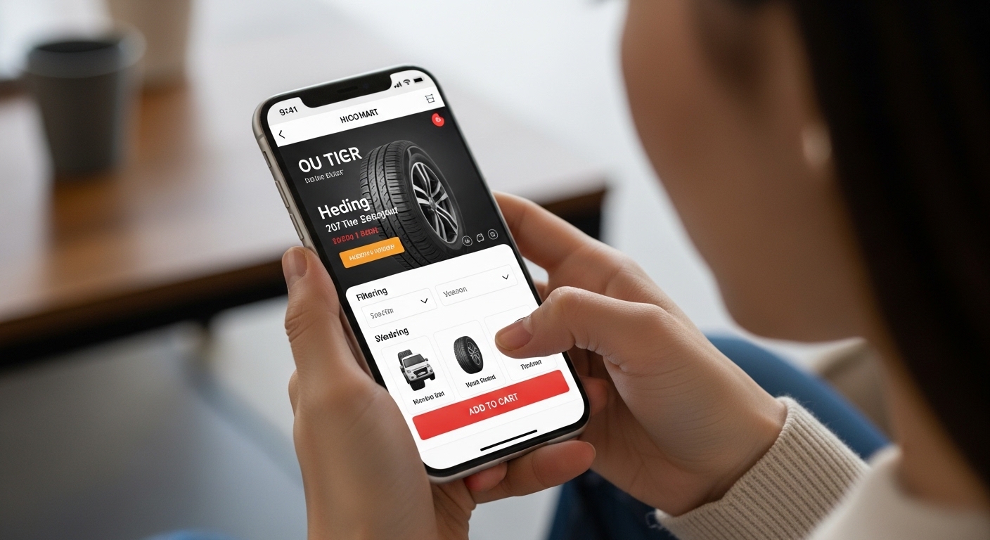
Why Mobile-First Matters
Over 70% of online shopping happens on mobile devices. Our platform is built with a mobile-first approach, meaning we design for mobile users first, then enhance for larger screens. This ensures a seamless experience regardless of how customers access your shop.
Core Features
Touch-Optimized Interface
Large, easy-to-tap buttons and intuitive navigation designed for finger input.
Fast Mobile Performance
Optimized code and images ensure quick loading times even on slower networks.
Responsive Design
Automatically adapts layout and content to fit any screen size perfectly.
Native Mobile Features
Leverages mobile capabilities like GPS location, push notifications, and more.
The Impact on Your Business
- Higher Engagement: Mobile users spend more time on optimized sites, increasing purchase likelihood.
- Better Rankings: Google prioritizes mobile-friendly sites in search results.
- Reduced Bounce Rates: Fast, intuitive mobile experiences keep customers browsing.
- Increased Conversions: Streamlined checkout process increases mobile sales by up to 40%.
Start Selling to Mobile Customers
Don't leave money on the table. Get your mobile-optimized tire shop online today.